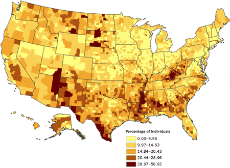
Classed Choropleth maps are aerial units that are unified
into smaller groups and are depicted in intervals (typically 4-7 intervals used).
This classification is typically data from states and counties. Sometimes,
different colors are used to show the density of components and hopefully portray
the trends it embodies and is usually a subjective process. For example, in this map, the lighter the
color of an area is, the less percentage of individuals is present. However,
the darker the area is, the larger amount of a population is present.
No comments:
Post a Comment